CSS positioning: how to?
When I started to learn CSS, my first challenge was understanding why there were so many different ways to position elements and what are the main differences between them.
Let's start with the very basic concepts. The browser interprets the HTML flow from left to right and from top to bottom. Whenever we add HTML elements to our website, we will see that there are 2 different kind of elements which already have a default position:
→ Inline Elements get positioned in a row next to each other: span, a, img, strong, em, button, input, label, select, textarea, etc.
🔲 Block Elements always start on a new line: div, header, nav, section, article, aside, main, footer, audio, video, figure, figcaption, form, table, ul, ol, li, p, hr, headings (h1-h6), etc.
See some examples here.
Easy. Now when we talk about CSS position properties, there are a bunch of them: position, display, z-index, float, clear, flex-box and grid. Why do we need so many and what are the differences between them? One of the things that helped me to understand them was creating a technical documentation project, which summarises all concepts in an easy way with visual and practical examples. Check them out here!
But let's go deeper into the newest and most used and efficient position properties: flex-box and grid.
FlexBox vs Grid
One of the main differences between both properties is that flex-box organises multiple elements in 1 dimension (rows or columns), while grid organises multiple elements in 2 dimensions (rows and columns)
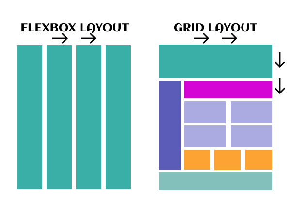
The flexbox layout offers the possibility to make items adapt (width, height and order) more easily to the available space depending on the device screen size. It is very useful on app/web components or small layouts, while the Grid layout is recommended for larger projects. Have a look at both examples:

On the one hand, the Flexible Box Layout organises multiple elements (flex items or children) within a container (flex container or parent element) It has an inline position by default. On the other hand, Grid also positions multiple elements within a container but their default position is a block or column.
See the Pen FlexBox vs Grid by Cristina (@pcrispitipina) on CodePen.
The above example is very simple but not very elegant. In order to start playing with the elements position and make our website's layout a bit more professional, we need to explore the Flexbox and Grid properties.
FlexBox Properties
As explained before, the first thing we need to do is create a flex container with some flex items inside. The second step is to start applying the flexbox properties to the parent container or the children elements.
| Flex container properties | Flex items properties |
|---|---|
| justify-content | flex-grow |
| align-items | flex-shrink |
| flex-wrap | flex-basis |
| flex-direction | flex |
| align-content | order |
| flex-flow | align-self |
Flex container properties
These properties help positioning the items within the parent container.
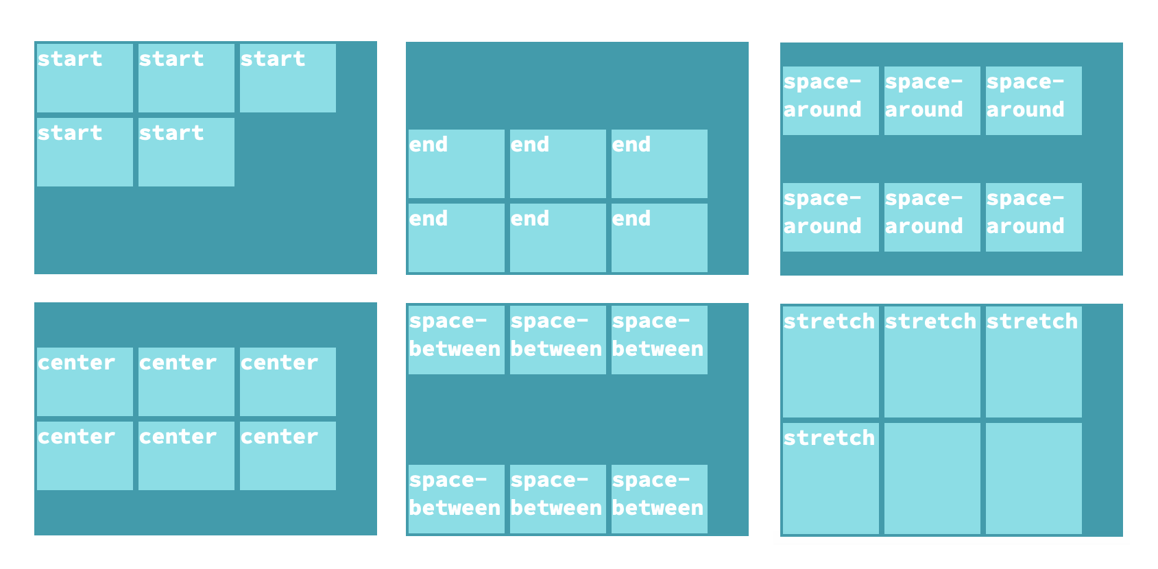
Justify-content: positions flex items from left to right. Values: start, end, center, space-between, space-around, space-evenly.

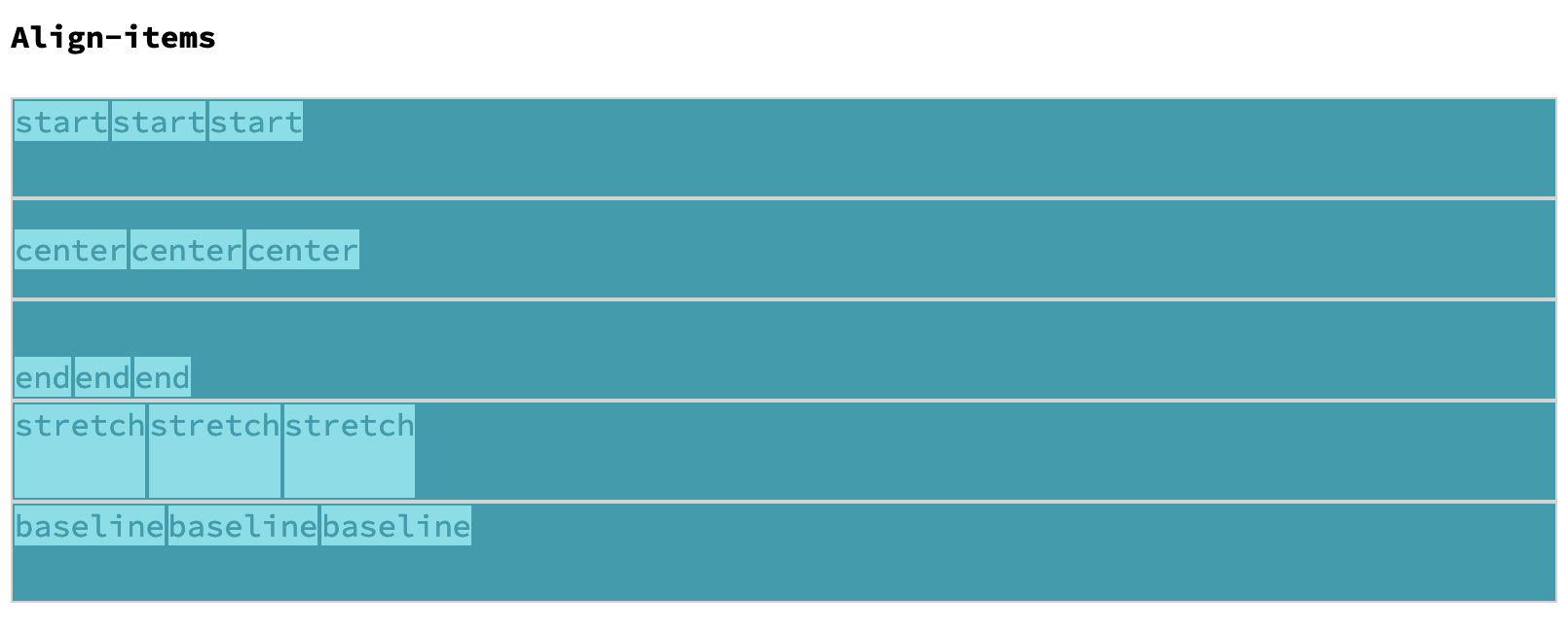
Align-items: aligns items vertically within the same line or row. Values: start, end, center, baseline, stretch. Although start and baseline look very similar, the main difference is that baseline aligns items text content.
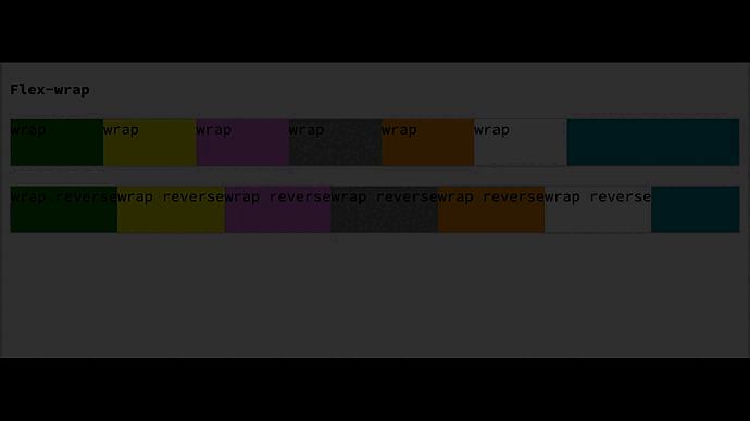
Flex-wrap: items move to the next line or row when there is no available space. Values: wrap, wrap-reverse, nowrap.
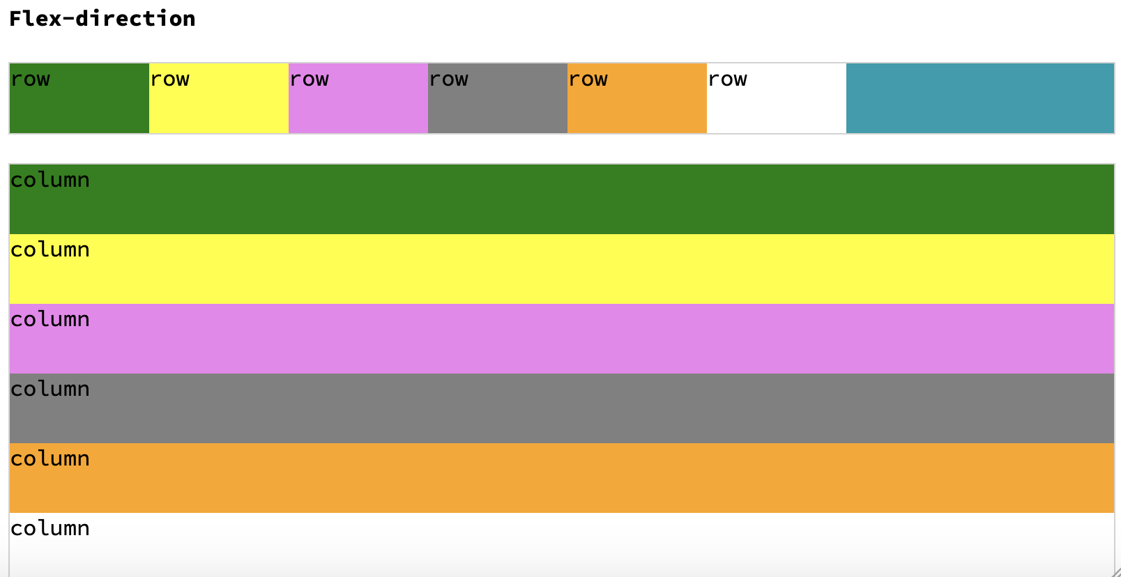
Flex-direction: places items in a row or a column. Values: row, row-reverse, column, column-reverse.
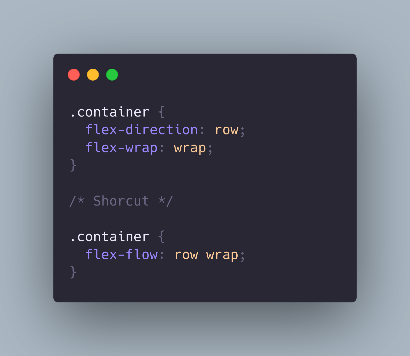
Flex-flow: a shorthand that combines flex-direction and flex-wrap.
Align-content: similar to align-items but it aligns the items when there are multiple lines. Values: start, end, center, space-between, space-around and stretch.
Find a summary with all properties here.
Flex items properties
These properties are applied to the flex container items/children.
Flex-grow: makes items bigger. Whenever the browser size changes, the items also grow their size proportionally. Values: numbers.
Flex-shrink: works the same way as flex-grow but makes the items smaller proportionally when there is no enough space. Values: numbers.

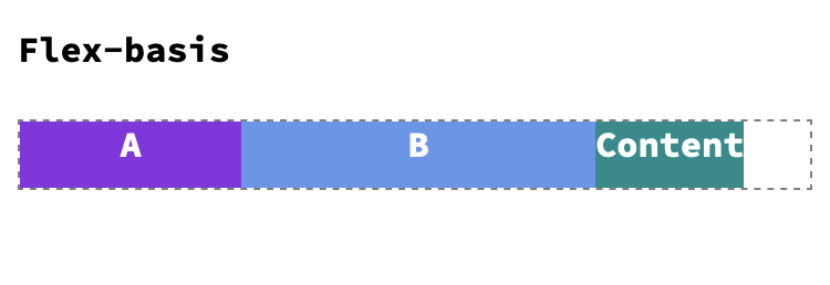
Flex-basis: defines the item' size. Values: width (px, em, rem), based on the content (content), etc.
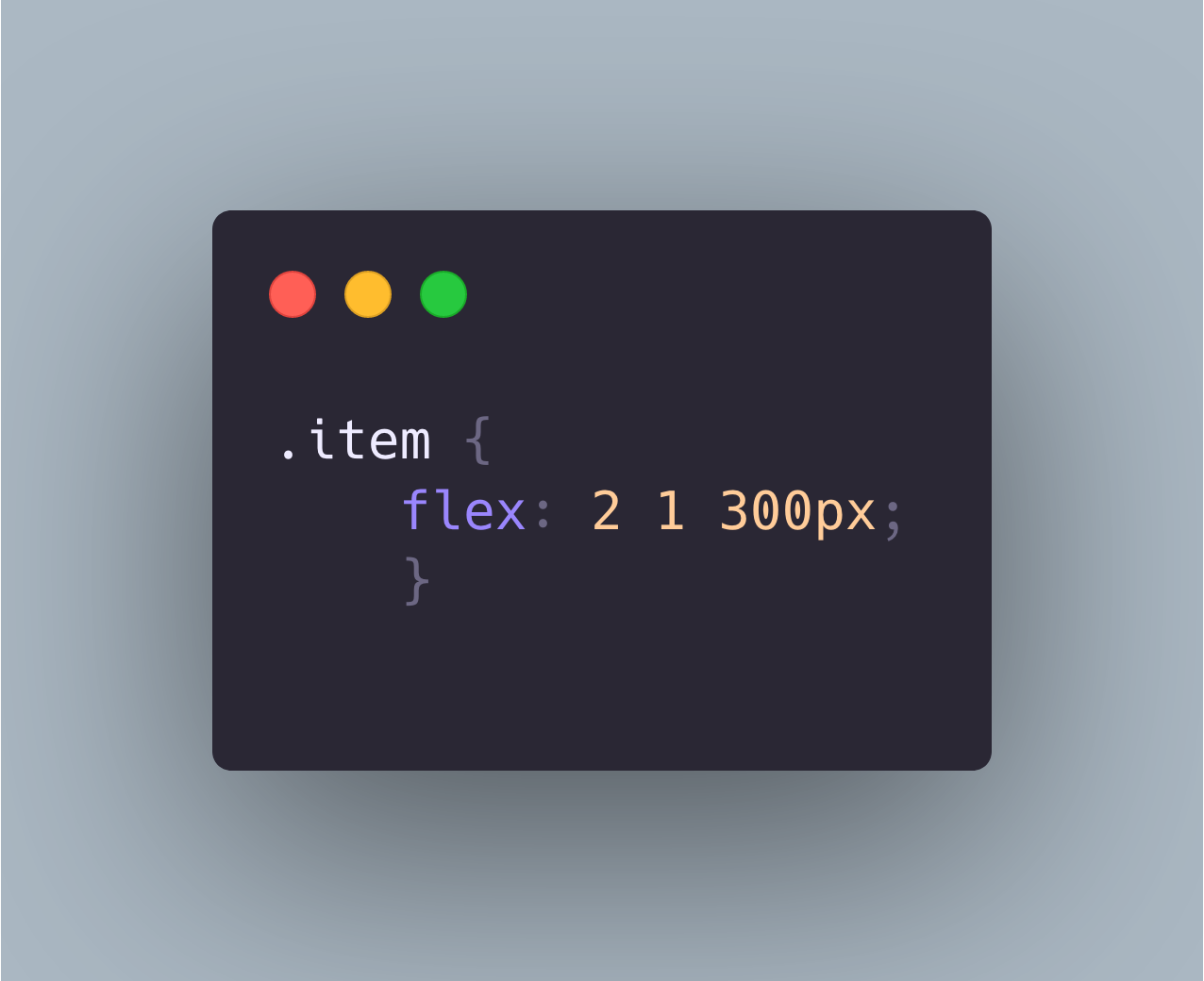
Flex: a shorthand that combines flex-grow + flex-shrink + flex-basis.
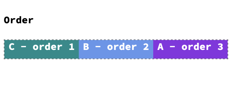
Order: orders the items appearance based on a specified number. Values: positive or negative numbers.
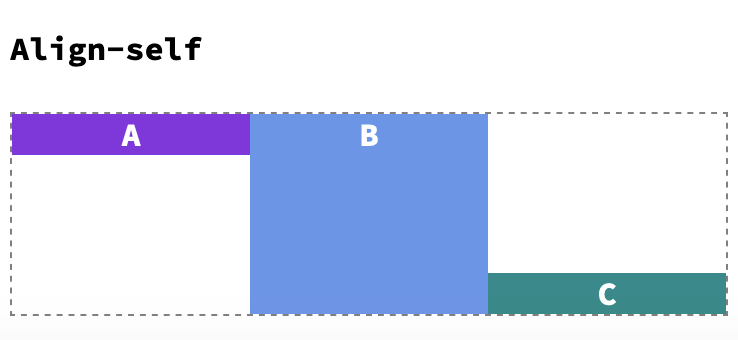
Align-self: aligns items vertically within the container. It overrides the align-items container property. Values: start, end, center, baseline and stretch.
Find a summary with all properties here.
As you can see, flexbox has a great variety of properties. Before getting into the grid properties, I would first recommend you to go through flexbox again, practise and be sure you understand everything. Don't rush. Don't feel bad if you don't get them at first glance. Remember that your brain also needs breaks to process all information.
🧘🏻♀️ Disconnect to reconnect 🧘🏻♀️
Grid Properties
As briefly described before, a grid is a two dimensional layout that organizes elements in rows and/or columns. We can start in a similar way to Flex: we create a grid container (display: grid), where we define the number of rows and columns (maximum 12). Afterwards we place grid items inside them.
On the one hand, there are some properties, which are applied to the grid parent container to create a grid layout (amount, position and space between rows and columns) On the other hand, the properties applied to the grid items are very useful to determine the items size or expansion along rows and columns.
| Grid container properties | Grid items properties |
|---|---|
| grid-template-rows/columns | grid-row-start/end |
| grid-row-gap, grid-column-gap | grid-column-start/end |
| grid-gap | grid-row/column |
| grid-template-areas | grid-area |
| grid-auto-rows/columns | |
| grid-auto-flow |
But we are not done yet! The below properties are very handy to align all grid items inside the parent container or align the items inside a single cell.
| Grid container properties | Grid items properties |
|---|---|
| justify-items | justify-self |
| align-items | align-self |
| place-items | place-self |
| justify-content | |
| align-content | |
| place-content |
Grid container properties
Let's customize our own grid layout. We will first create a grid container with some rows and columns. How to do that? Defining the following grid container properties:
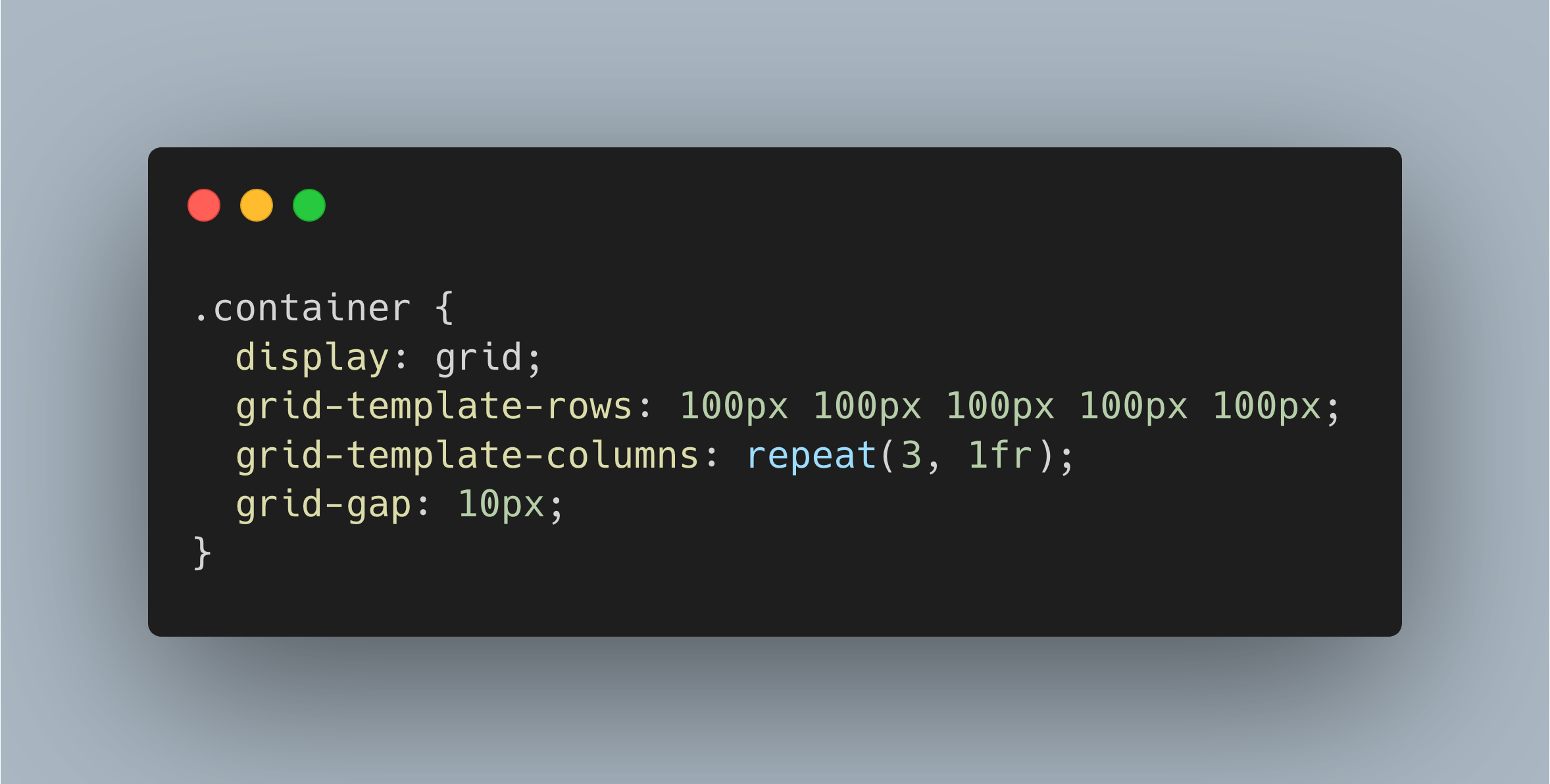
This piece of code is literally defining a grid container with 5 rows (100px each), 3 columns (1fr each) and 10px space between them (gap).
There are 2 ways to define rows and columns: either writing the row and/or column size as many times as number of rows and columns we need (grid-template-rows) or with the shorthand repeat(number of rows/columns, size).
There are also different ways to define the size. We can of course keep using px, em or rem but the grid has a special unit called fraction (fr), which takes the whole container size and calculates portions or fractions we choose for each element, without any math's calculation.
Moreover, we can use grid-gap-row and grid-gap-column or the shorthand grid-gap to define the space between rows and columns.
See the Pen Grid layout by Cristina (@pcrispitipina) on CodePen.
Another approach could be building a layout template with the grid-template-areas property. Once again we create our HTML elements (a container with its children):
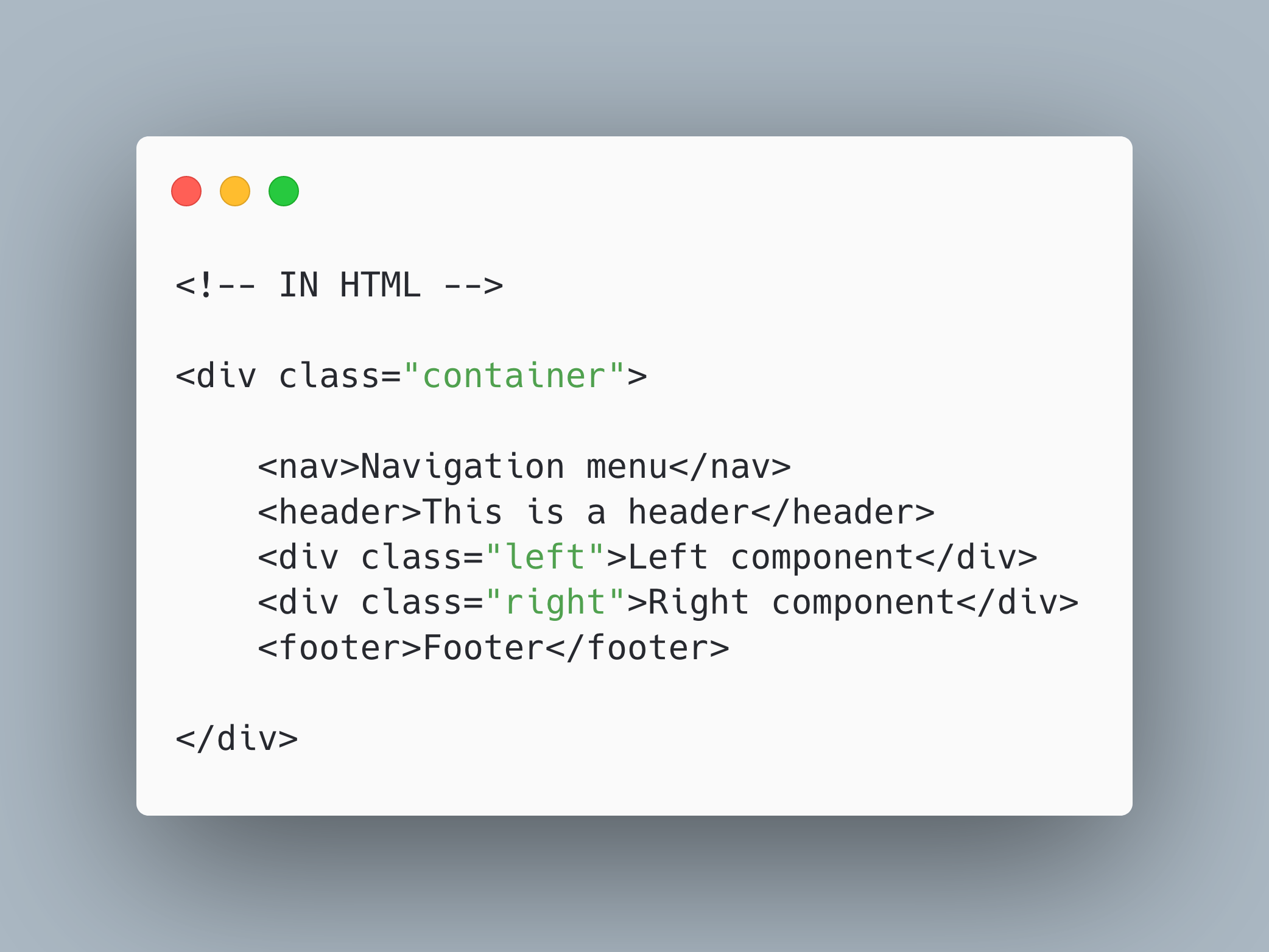
Afterwards we define a grid with some rows and columns. However, we need to reference the names of the grid areas. These are basically the names applied to the items within the grid container:
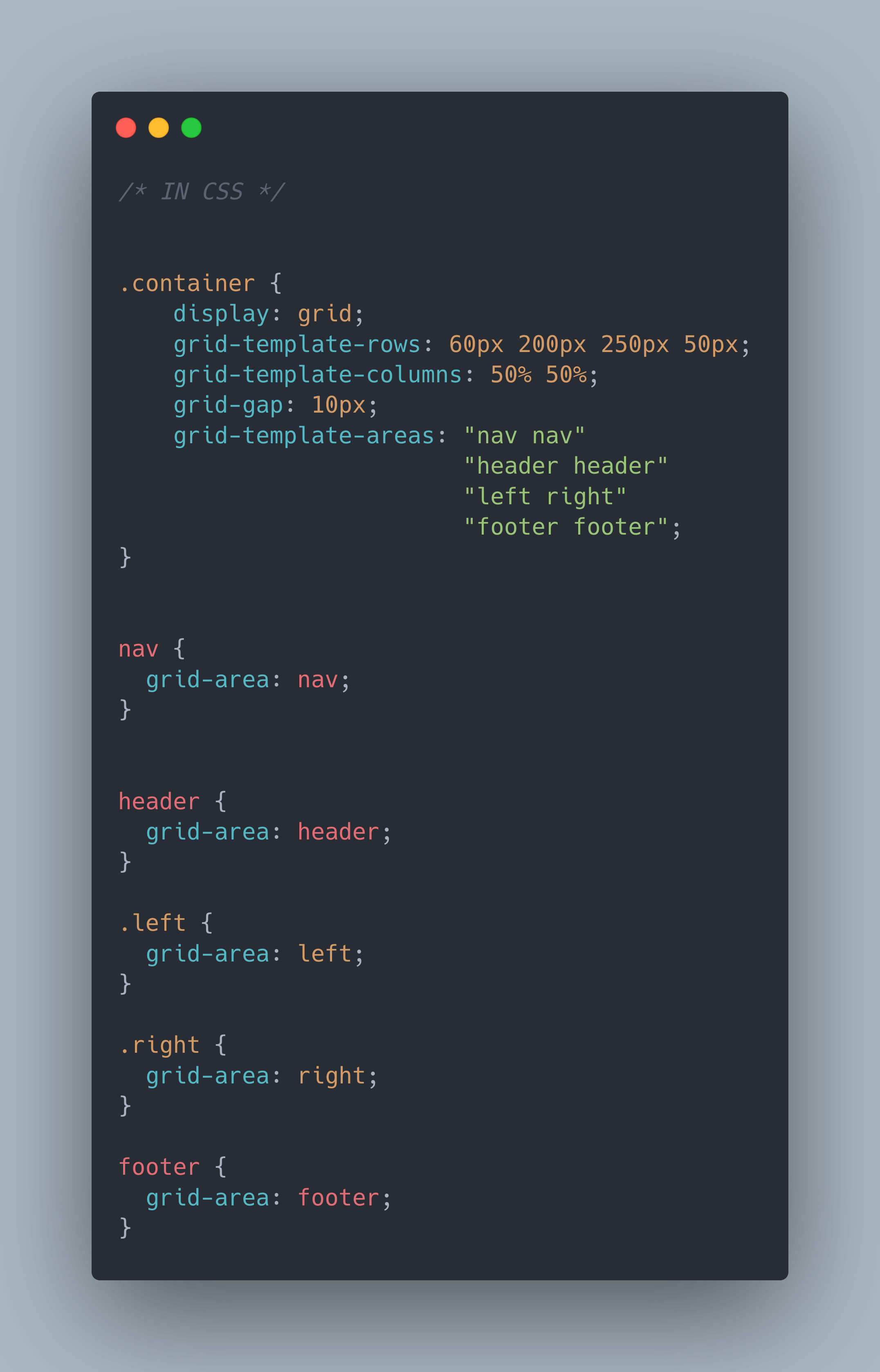
The final result would be:
See the Pen Grid-template-areas by Cristina (@pcrispitipina) on CodePen.
Grid-auto-rows and grid-auto-columns are very useful when we place a grid item in a row or column that we haven't defined yet in a grid-template-row or grid-template-column.
These properties are very handy when building a website without knowing the amount of information in advance. For example, an online shop where we will keep adding products in the future.
See the Pen Grid auto property by Cristina (@pcrispitipina) on CodePen.
If we analyze the previous example, we have set a grid with 2 rows (60px each) and 3 columns (100px each) However we have 4 items, so how do we do so that they get equally distributed along 3 columns? Here is where grid-auto-rows in. This property helps us add an extra row in case there is no space left for “upcoming items”.
Grid-auto-flow goes hand in hand with grid-auto-rows/columns as it helps specifying how upcoming items will be added (rows or columns) Values: row, column, dense.
Let's now have a look at the container properties, which values get applied to ALL grid items. You will find some similarities with the flexbox properties.
| justify-items | align-items | place-items |
| justify-content | align-content | place-content |
Justify-items aligns items horizontally (along a row) Values: start, end, center, stretch.
Align-items is the opposite to justify-items. It aligns items vertically (in a column) Values: start, end, center, stretch, baseline.
See the Pen Grid container properties by Cristina (@pcrispitipina) on CodePen.
Place-items is a shorthand of the previous properties. The first value sets align-items and the second justify-items. If only one value is defined, it will be assigned to both properties.
Sometimes it can happen that the grid items are much smaller than the total grid container. In this case, we can use justify-content to align the grid items along a row or align-content to align the grid items along a column.
See the Pen Grid container: Justify-content by Cristina (@pcrispitipina) on CodePen.
Once again, place-content is a shorthand of the previous properties: align-content and justify-content.
Grid items properties
Let's start getting deep into customising rows and columns within a container with these properties:
grid-column-start, grid-row-start, grid-column-end and grid-row-end let us customise our items size within a row or a column.
See the Pen Grid items properties by Cristina (@pcrispitipina) on CodePen.
If you have a look at the code of the previous example, you will see that these properties let us define in which row or column our item will start and where it will end. A shorthand of these properties are grid-row and grid-column. The following pieces of code are equivalent:
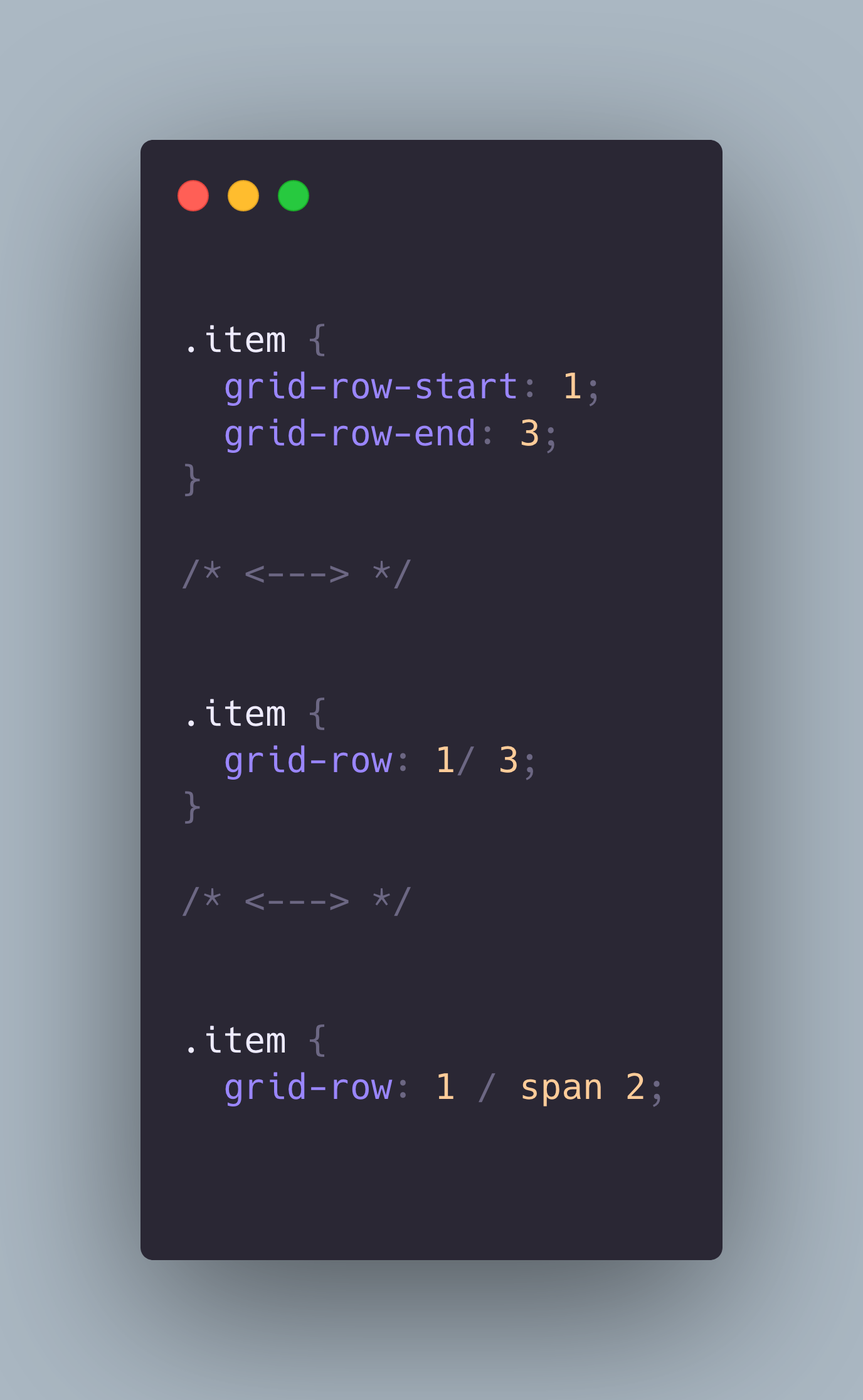
We can also use span in combination with the previous properties as a shorthand.
At the same time grid area is also a shorthand for grid-row-start + grid-column-start + grid-row-end + grid-column-end. It can also be used in combination with grid-template-areas, as described before.
Last but not least, let's have a look at the last 3 properties, which align individual grid items inside a cell.
| justify-self | align-self | place-self |
justify-self aligns grid items within a cell horizontally. On the opposite side, align-self aligns grid items withing a cell vertically. Both properties have the same v values: start, end, center, stretch
See the Pen Grid items properties: justify, align, place-self by Cristina (@pcrispitipina) on CodePen.
In the above cases, we have created 2 grids. Each of them contain 2 rows and 2 columns. As you can see, in the first grid, the grid items get aligned within them cells horizontially, while in the second grid, the grid items get aligned vertically.
place-self is a shorthand of the previous properties. The first value sets align-self and second sets justify-self.
You might feel overwhelmed with so many flex and grid properties but you don't need to remember all of them. Try to understand first the differences between flexbox and grid and the rest will come whenever you start practicing. Also remember that you don't really need to use both of them. You might prefer flexbox over grid or the other way around. Or you might even combine both!
Summary
- Flexbox (1 dimension) vs Grid (2 dimensions)
- Flexbox for web components or small layouts vs Grid for larger projects
- Flexbox good browser support vs Grid most recent browsers versions support
- Flexbox inline default position vs Grid block default position
- Grid unit: fr (fraction)
- Grid shorthand: span, repeat
Practise, practise, practise
It is said that “practice makes the master” and after so much theory it is time to build something from scratch, sweat, fail, learn and have fun! 🚀
"In theory there is no difference between theory and practice - in practice there is"
✨ Yogi Berra ✨
Below you can find some great and fun games to practise CSS positioning. I especially love Fronten Mentor, where you can find a lot of different projects for different levels and a great community that will support you and give you feedback along your way. Good luck!
- Position static, relative, absolute, fixed: CSS Sundae
- Flexbox: FlexBox Froggy
- Flexbox: FlexBox Zombies
- Grid: Grid Garden
- Components & Websites challenges: Frontend Mentor